CSS: Box Model

Box Model
Each html model consists of an encapsulation of boxes (i.e. rectangles).
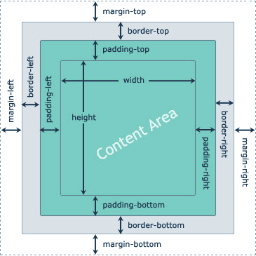
The content area is where the value (content) of an html element goes. The content space is shared with the padding, meaning that if a background color is applied to the element, the padding area gets colored as well. The border box wraps the content area and has its own attributes. Finally, the margin area controls the position of an element relatively to its parent. It is by the way styled according to the parent's content area.
On this picture, we can see that padding concentrates the content relatively to the element's border. margin on the other hand pushes the element relatively to its parent edges.
When width and height are set on an element, they only apply to the content area. If margin, border and padding are different than 0, then the element occupies more space on screen
total width = width + padding left + padding right + border left + border right + margin left + margin right
Same reasoning with height of course.
Dimensions
As explained above, you can set the width and height of the content area of any html element in CSS.
div {
    /* You can set width and height in px, % or any length value (px, em, rem,...).
     * Besides, you can use 'auto' to let the browser calculate suitable dimension(s),
     * 'initial' to set the default value(s) or 'inherit' to use parent values. */
    width: 300px;
    height: inherit;
    /* When the dimesion of the content is dynamic (not fixed), you can define dimension
     * limits to control the display to some extent, for instance to define a range of valid
     * dimensions */
    max-width: 500px; /* can't grow above this width, even with width set to a higher value */
    max-height: 50px; /* can't grow above this height */
    min-width: 50px; /* can't shrink below this width */
    min-height: 5px; /* can't shrink below this height */
}
Note: By default, html block elements will have a width of 100%. In general, avoid setting fixed dimensions unless it is necessary (prefer using em, rem, %).
Padding
You can specify padding values for each sides of the content area (padding-xxx with xxx one of (top, right, bottom, left)).
Negative values aren't supported.
div {
    /* The value can be set in px, % or any length values (em, rem, ...).
     * You can also use 'inherit' to apply the same padding value as the parent */
    padding-top: 50px;
    padding-right: inherit;
}
Shorthand
The shorthand notation lets apply all padding values in one line:
pre {
    padding: 2px; /* applies to all sides */
    padding: 1px 2px; /* vertical and horizontal */
    padding: 1px 2px 1.5px; /* top, horizontal and bottom */
    padding: 1px 2px 1px 2px; /* top, right, bottom and left */
}
Border
The border sits between the margin and the padding areas an could be styled with various options.
h1 {
    /* Border style defines how the border looks like.
     * none/hidden : no border (default)
     * dashed: line is dashed
     * dotted: line is dotted
     * double: 2 parallel lines are drawn
     * inset/outset: bicolor 2d frame is drawn
     * groove/ridge: bicolor 3d frame is drawn */
    border-style: dashed;
    /* Set the thickness of the border. You can use any length value (p, em, rem...)
     * or pick one of predefined profiles : 'thin', 'medium' or 'thick'
     * Note: this is a shorthand notation, you could also set width for each side.
     * Note: border-style must be different than 'none'/'hidden'*/
    border-width: 1px;
    /* Set the color of the border.
     * Note: this is a shorthand notation, you could also set color for each side.
     * Note: border-style must be different than 'none'/'hidden'*/
    border-color: #ff0030;
    /* Create rounded borders. The value represents the size of the arc. */
    border-radius: 20px;
    /* With CSS3 you can use an image to draw the border. The sides and corners
     * of the specified image will be replicated and stretched to wrap your content */
    border-image: url("border.png") 20 20 round;
}
Shorthand
As usual, there is a shorthand notation to set all properties at once.
p {
    /* In this order: width, style, color.
    * Note: You can omit a parameter (2px red) and it will take its default
    * value if any) */
    border: 2px dotted red;
}
Margin
The margin is upper coating of the box model and is always transparent.
You can specify margin values for each sides of the content area (margin-xxx with xxx one of (top, right, bottom, left)).
Negative values are supported.
div {
    /* The value can be set in px, % or any length values (em, rem, ...).
     * You can also use 'inherit' to apply the same margin value as the parent
     * or 'auto' to let the browser compute the ideal margin value */
    margin-top: 50px;
    margin-right: inherit;
    margin-bottom: -1px;
}
Shorthand
The shorthand notation lets apply all margin values in one line:
pre {
    margin: 2px; /* applies to all sides */
    margin: 1px 2px; /* vertical and horizontal */
    margin: 1px 2px 1.5px; /* top, horizontal and bottom */
    margin: 1px 2px 1px 2px; /* top, right, bottom and left */
}
Horizontal centering technique
When the margin is set to auto, the free space in container's width is split to calculate the margin values on each side of the element. As a consequence, the element is centered. This is a common technique use in frontend development.
div {
    width: 200px;
    margin: 0 auto;
}
Outline
Outlines are used to indicate focus on elements by drawing a line outside their border, in the margin area. Although they look similar to borders, they differ in many important ways:
- The outline is not part of the Box Model
- An outline does not take space, it overlaps. The dimensions of your element with it
- You can style the outline on each side of the element
Syntactically, the outline is very similar to the border.
h1 {
    /* Outline style defines how the outline looks like.
     * none/hidden : no border (default)
     * dashed: line is dashed
     * dotted: line is dotted
     * double: 2 parallel lines are drawn
     * inset/outset: bicolor 2d frame is drawn
     * groove/ridge: bicolor 3d frame is drawn */
    outline-style: double;
    /* Set the thickness of the outline. You can use any length value (p, em, rem...)
     * or pick one of predefined profiles : 'thin', 'medium' or 'thick'
     * Note: outline-style must be different than 'none'/'hidden'*/
    border-width: 1px;
    /* Set the color of the outline.
     * Note: outline-style must be different than 'none'/'hidden'*/
    border-color: #ff0030;
}
Shorthand
The shorthand notation to set all properties at once.
p {
    /* In this order: width, style, color.
    * Note: You can omit a parameter (2px red) and it will take its default
    * value if any) */
    outline: 2px dotted red;
}
Common usage
By default, active links have an outline drawn. You can change the default style if you need to.
a, a:active, a:focus {
    outline: none;
}
Box sizing
Since adding a padding and/or a border affects the actual size of the element, creating nice layouts that fit in the viewport could be an intricate task. To ease it up a little bit, CSS3 introduced the box-sizing property so that the size of padding and border is substracted out of the content's width/height. In other word, it is like applying width/height to the whole Box.
.sized {
    width:100%;
    padding: 10px;
    background: pink;
    border: 5px solid #ffff33;
    /* Thanks to this line, no scrollbar will appear and the
     * element will occupy full width with padding and border applied */
    box-sizing: border-box;
}