CSS: Layouts

Layout
Understanding the Box Model is not enough to have a clear vision of how CSS will style your page. Many other factors have an influence on the final rendering such as :
- display type of html element (block or inline)
- positioning scheme (normal flow, float or absolute)
- viewport size, image dimensions, etc...
Display
The default display property (block or inline) of html elements can be overriden in CSS stylesheet and heavily affects how the page is rendered. Here is what differs between each display type:
| Type | Description |
|---|---|
inline |
Element is displayed inline (no breaks). width and height properties have no effect. Instead it always occupies as much width as its content. |
block |
Element is displayed as a block (breaks at beginning and end). It takes up the full width available. |
inline-block |
Element is displayed inline as a block (no breaks). width and height are properly applied |
flex |
[CSS3] Element is displayed with a flexible block-level layout entirely built in CSS |
inline-flex |
[CSS3] Element is displayed with a flexible inline-block layout entirely built in CSS |
none |
The element does not appear because no box is generated for it (or its children). It simply does not exist. |
span {
    display: block; /* replaces default 'inline' */
}
p {
    display: inline; /* replaces default 'block' */
}
Make sure to always remember the html rules:
- an inline element can't have a child with a block display
Changing the default display type of an element does not overrule that, you still won't be able to have block elements inside (orignally) inline elements.
Flexbox
The flexbox properties introduced with CSS3 are quickly becoming the new standard for creating layouts without interfering with the html markup. It consists in having a flexible container (e.g. a div) that will hold flex items. To understand how they are rendered, it is important to visualize the spatial representation of a flexbox:
         A flexbox can be represented in a 2D space but lays out items in 1 direction

                            Main axis
        (oriented according to local writing direction)
                .------------------------------------------->
                | ---------------------------------------
                | |  Flex     ||  Flex     ||  Flex     |
    Cross axis  | |__Item 1___||__Item 2___||__Item 3___|
(orthogonal to  |
Main axis)      | Each element inside a flex container automatically
                |  becomes a flex item
                v
By default, flex items are displayed in a row along the flex line (the Main axis). The direction can however be modified with flex-direction:
row(default) : depending on local culture, from left to rightrow-reverse: opposite ofrowcolumn: same asrowbut top to bottomcolumn-reverse: opposite ofcolumn
.container {
    display:flex;
}
.items {
    flex: 1;
}
With the code above, the items will be laid out on full width, sharing all the available space. This behavior can be modified with flex-wrap:
nowrap(default) : items fit in one linewrap: when there is no more space to display an item, it wraps onto next line. The first line is at the top and each new line is added underwrap-reverse: same aswrapbut first line is at the bottom and each line gets added above
Note that there is a shorthand to set direction and wrap at once:
.items {
    flex-flow: column wrap;
}
Speaking of shorthand notations, the flex property used in the first example is a shorthand for several properties:
flex-grow: specifies how much of the container's remaining space should be assigned to the item. When it is set to 1, the space is evenly shared by flex items. However, if 2 items have a value of 1 and a third has a value of 2, the total space is (1+1+2) 4 which means that the third item will occupy half of the container.flex-basis: initial main size of an itemflex-shrink: it's the opposite offlex-grow. It gives a ratio factor indicating by how much the size of the item should be divided (if0, original size is used)
but it is recommended to always use flex as it resets unspecified properties correctly.
/* As specified on mdn documentation, the meaning of flex properties varies depending on
 * the units */

/* One value, unitless number: flex-grow */
flex: 2;

/* Two values: flex-grow | flex-basis */
flex: 1 30px;

/* Two values: flex-grow | flex-shrink */
flex: 2 2;

/* Three values: flex-grow | flex-shrink | flex-basis */
flex: 2 2 10%;
Important: float, clear, vertical-align and column have no effect in flex containers.
Covering everything that it is possible to do with Flexbox in a single article is difficult. Besides, some great resources are hard to beat so I strongly recommend you to visit css-tricks and/or to watch the very nice video series What the Flexbox that covers it very well.
Visibility
With visibility, you can change the rendering of html elements without changing the structure of the tree, meaning that the boxes won't be deleted if the element is hidden (as opposed to display:none).
div {
    /* Sets the visibility of an element.
     * 'visible' (default) : the box and its content are visible
     * 'hidden' : the box and its content are invisible but still are in the layout
     * 'collapse' : same as 'hidden' except for tables (see below)
     * 'inherit' : applies visiblity of the parent */
    visibility: hidden;
}
When applying collapse to table elements, they get removed. However, they still affect the layout of the table.
Positioning
We've seen how the display property affects the rendering of an element in the layout. This is called the Normal Flow, a rule based solely on the block or inline nature of the elements.
The positioning method of an element is static by default, meaning that the element in positionnend into its normal position in the Normal Flow.
p {
    /* Makes absolutely no difference in the display */
    position: static;
}
Then there is the relative position which lets you shift the element from its original position in the Normal Flow with top, left, bottom, right properties.
When shifted, the content of the element will overlap with others but the space reserved in the layout for the element will remain identical.
p {
    /* The paragraph box will be at the same position on screen but the element will appear shifted down,
     * potentially overlapping the element that was right below */
    position: relative;
    top: 150px;
}
If you opt for absolute position, there are 2 things to consider:
- it takes the element out of the Normal Flow, meaning that its box will take no space among siblings
- the position is relative to the first parent that has a position different than
static(or the top-left corner if none is found)
The elements positioned with absolute will very likely be overlapping their siblings.
.inner {
    position: absolute;
    /* Here again, use 'top', 'left', 'right', 'bottom' properties */
    left: 2px;
}
If we consider the following html code, the inner div will apear on top of the paragraph, simply because it is taken out of the Normal Flow.
<div class="outer">
    <div class="inner">
        This content will overlap the siblings
    </div>
    <p>Dummy context that will be positioned below the inner div</p>
</div>
Finally, if you want to position an element absolutely on a page that does not move when the page is scrolled, use fixed positioning. With fixed, the element is fixed with respect to the browser's viewport.
.inner {
    position: fixed;
    /* Here again, use 'top', 'left', 'right', 'bottom' properties */
    top: 50px;
    left: 300px;
}
Layers
In addition to position that lets you place elements in a 2D space, z-index offers you an option to place elements on top of each others, along the z axis.
Note: z-index is only applicable to elements with a position different than static (default).
.above {
    position: absolute;
    top: 50px;
    /* z-index is expressed with an integer that gives the level of the element on z axis.
     * If higher, the element is placed on top. Negative values are also possible */
    z-index: 2;
}
Float
Put simply, float lets you rearrange elements within a container by stacking (some of) them left or right. Neighbour elements will be inlined next to them on the horizontal line (we say that they float around them). It is a popular technique used to wrap text around images.
Remember how absolute positionning was removing an element from the Normal Flow ? Well there is more complication if you use float. By definition, float removes an item from Normal Flow but the element is still in the flow. It is some sort of reordering of the Normal Flow that also alters how neighbour elements are displayed.
<div class="left">1</div>
  <div class="left">2</div>
  <div class="right">3</div>
  <p>
    This text will be inlined after div '2' and before div '3'
  </p>
</div>
div {
  margin-left: 5px;
  width: 50px;
  height: 150px;
}

.left {
  /* You can float left or right (none is the default) */
  float: left;
  background: pink;
}

.right {
  float: right;
  background: cyan;
}
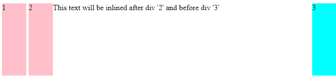
If you want to prevent some elements from floating around, you can use the clear property by telling which side of the element should be cleared. In the example above, we will print the paragraph on next line.
p {
    /* since by default, elements float from left to right, clearing the left edge will
     * reposition this element onto next line */
    clear: left;
}
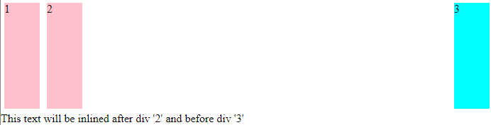
None of the div has been repositionned and there is now an empty space between them.
Columns
When you want to display an element throughout several columns you can chose to set one of the following properties:
column-count: Explicitely defined the number of columns to applycolumn-width: Defines the ideal width of the each column and the total number is deduced (the final size will depend on the available space).
p {
    /* You can only use one or the other. Don't mix 'count' and 'width' */
    column-count: 4;
    /* [Optional] Set the distance between columns */
    column-gap: 10px;
    /* [Optional] Draw a vertical line between columns (thickness style color)
     * This is a shorthand, you can also use independent properties ('column-rule-color',
     * 'column-rule-style' and 'column-rule-width') */
    column-rule: 1px solid blue;
    /* [Optional] Define how the content is spread among columns
    * 'auto' (default): columns filled sequentially
    * 'balance': content balanced among columns */
    column-fill: balance;
}
Another common approach to build a multi-column layout is to combine float and box-sizing.
.box {
    width: 30%;
    padding: 20px;
    margin-left: 3px;
    background: #f2f2f2;
    float: left;
    box-sizing: border-box;
}
.box:first-child {
    /* With 'first-child' pseudo selector, we can remove the left margin on first
     * element */
    margin-left: 0;
}
<div class="box">
    <p>First column .....</p>
    <p>Second column .....</p>
    <p>Third column .....</p>
</div>
Each <p> column is stacked on the left with a margin of 3px between them.
Note that you can also use flexbox properties to create this type of layout.